[Case 01]
Wisconsin Native Vote Website Redesign
Advocacy
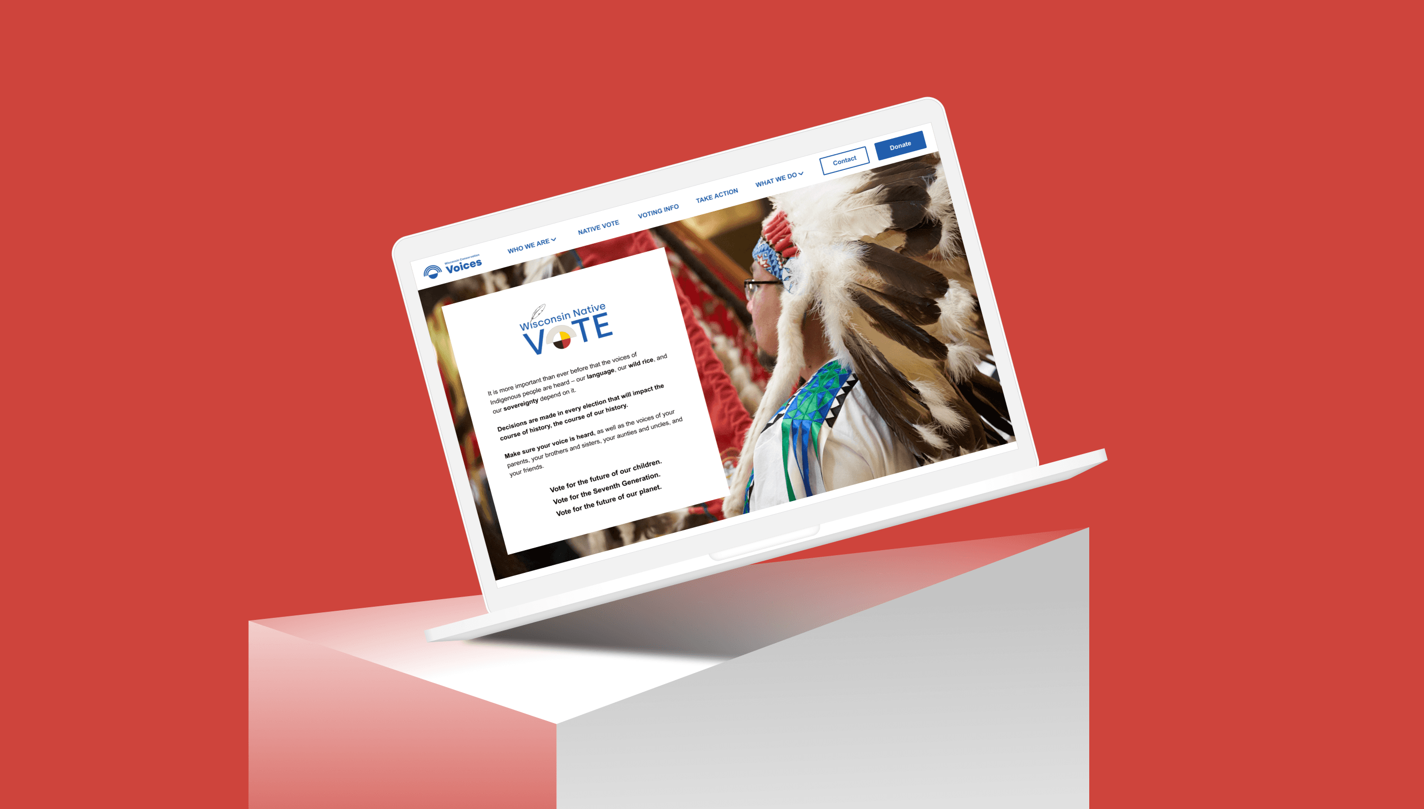
Designing a More Accessible Voting Experience
Design Interactive
[Background]
Wisconsin Native Vote is a program under Wisconsin Conservation Voices. Its content was hard to find and dense, so Native audiences couldn't quickly grasp the program or reach essential voting information.
[Project Overview]
Wisconsin Native Vote is a trusted program whose content was buried in a dense, hard-to-navigate site. On an 8-person team, I was one of two designers on the Voting Info page restructuring content, strengthening calls to action, and improving readability.
[Industry]
Advocacy
[My Role]
UI/UX Designer
[Platforms]
Figma/FigJam
[Timeline]
September 2025 - December 2025
[Results]
On an 8-person team, we redesigned Wisconsin Conservation Voices' Native Vote and Voting Info pages. Usability rose from a SUS of 86 to 91 and finding the Native Vote donate section got 50% easier. However, One task got worse: finding voter-registration documents dropped 33%.
[Research]
We audited the pages by annotating each section for its purpose, audience, and expected action — surfacing dense text, weak hierarchy, and low-contrast areas that were hard to read.
We also studied comparable civic and Native-vote organizations to see how they guide people toward action.
1
Key actions got missed
Users often overlooked important actions like donating or finding voter requirements.
2
Dense and hard to scan
Heavy text, weak hierarchy, and low contrast slowed reading and buried the information.
3
Culture wasn't reflected
The site's color and imagery didn't consistently reflect Native culture, weakening trust.
[Color Design]
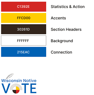
The original red/white/blue palette risked reading as patriotic — a real concern when speaking to Native voters. Guided by WCV and Tribal Libraries, Archives & Museums (including a Native advisor), we moved to a Medicine Wheel palette, already echoed in the logo, with Ojibwe-inspired florals as accents.
We also repurposed our use of red to act as a guider to signify statistics and action items.
[Decisions]

Final high fidelity prototype
We turned inline links into large buttons, added external-site icons so official links felt trustworthy, and used a white background with color-coded headers for readability.
We also aligned the page's colors with the Native Vote page so the two read as one site, and kept text and buttons above WCAG AA contrast — fixing the low-contrast areas testing had flagged.

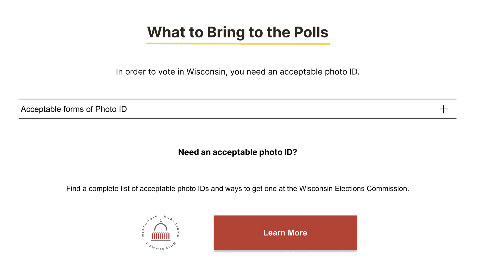
Before
After
Dense lists collapsed into accordions to cut scroll fatigue with content that stays one tap away, and a return-to-top button added on a long reference page.
[Testing]
50%
1.82:1 to 21:1
91
5.8%
We ran a between-subjects test — each participant used either the current site or the prototype, completing the same three tasks, and we measured task success, SUS, and (for Native participants) cultural resonance. Recruited through TLAM and personal networks, the sample was small — 5–8 split across the two versions — so the findings are directional rather than definitive. One Native participant noted the imagery felt credible and showed real community members, not stock photos.
[Takeaways]
Validate with your users
The people you're designing for are the only reliable read on whether it lands.
Meet real context
Design for how people actually arrive, not how you wish they would
Clarity over decoration
Reducing effort and sharpening hierarchy, not decoration, is what improved the experience.
What I would do differently
The voter-registration documents section got harder to reach once it moved into a low-contrast accordion. I'd ensure thicker lines or color blocking the accordion to show significance.