[Case 01]
Draycott Place Partners Website Redesign
Finance

A Modern Redesign that Restores Credibility
Draycott Place Partners
[Project Overview]
Draycott Place Partners is a business financing firm that supports CEOs and business owners with mergers and advisory services. Their website felt outdated, unclear, and lacked professionalism-expected in a high-trust B2B industry. My objective is to redesign the entire site in order to enhance trust, clarity of services, and overall credibility.
[Problem Statement]
The existing website suffered from an outdated design that reduced trust and credibility, and users struggled to quickly understand the company’s service offerings. Its structure was inconsistent and accessibility was low, creating friction in navigation and comprehension. Overall, the visual presence failed to reflect modern industry standards, making the brand appear less professional and reliable than competitors.
[Industry]
Finance
[My Role]
Lead UX/UI Designer
[Platforms]
Desktop
[Timeline]
June 2025-November 2025
[Process]
[01] User Research
Conducted a competitive analysis of financing firms to define the expected visual language and content hierarchy in high-stakes M&A.
Conducted a usability and motion audit of the legacy site to identify how excessive text animations impeded readability and/or professional tone.
[02] Insights
Identified the lack of visual hierarchy and legibility on the legacy site, especially with the interaction of complex background imagery and areas of high-motion.
Realized that the company had a high information load, which needed a more distinct navigable structure to enable viewers to search for a certain service without feeling the effects of fatigue in content.
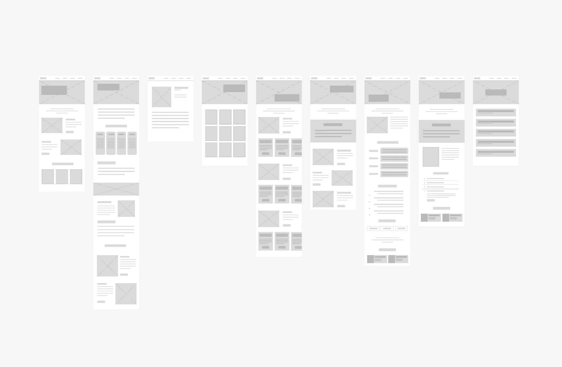
[03 Design Solution]
Organized content for Home, Service, and Industries pages through progressive Disclosure with "Learn More" buttons for handling content-heavy sections.
Developed an industry standard tombstone layout using carousels to display social proof of transactions in a clean and modern way.
[04] Testing & Iteration
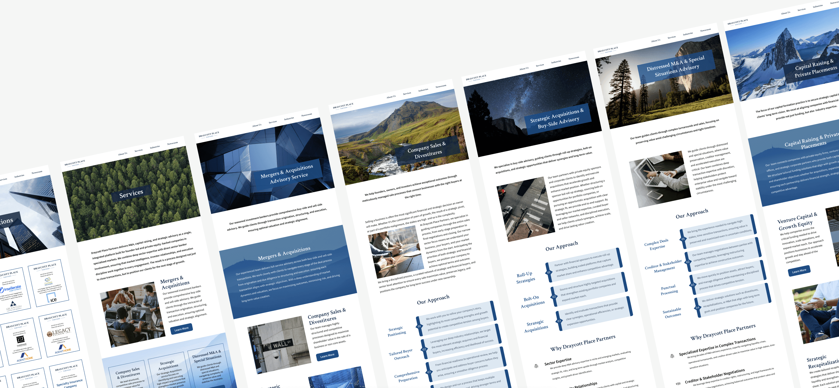
Employed a standardized system of contrast and legibility to ensure all text was accessible and professional in appearance, whether on every page or with any background style.
Revised visual layout and imagery, informed by stakeholder feedback on each iteration to ensure a final aesthetic that balances modern design with the firm's traditional professionalism.
[Outcome]
Led a full redesign of Draycott’s 24-page website from structure to visuals.
Modernized visuals and clearer structure strengthened trust and positioned the company as more professional and reliable.
Enhanced readability, contrast, and structure to create a more inclusive and user-friendly experience across devices.
[Key Learnings]
Independent learning builds confidence
Researching unfamiliar domains strengthened my ability to learn independently and adapt to new challenges.
Clear rationale earns trust
Explaining design choices strengthened alignment and client confidence.
Aesthetics and function must work together
Visual updates needed to reinforce usability, clarity, and business goals.